The grid module organizes site content into a cohesive layout, enabling appearance and user interaction customization. Options include shape, size, title, sort, and filter. You can also create multiple tabs with distinct filters and sorting for effective content categorization.
Select the + to the right of the Page Title and select Grid.
Select the new Grid item in the content menu below to start configuring your new grid module.
Module configuration
Name: Give the Grid a unique Name so that you can identify it later. The name doesn’t appear on the site page.
Fill out the fields listed below to customize your Grid.
Select Save Module to save your changes when finished.
Saving your changes
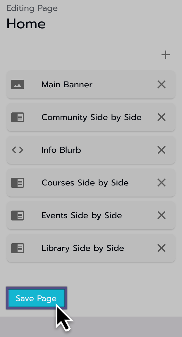
Remember to save your page updates when you are done editing any module to avoid losing progress by selecting the Save Page button.
Saving the changes made to the page.
Design options
Tailor the module's appearance and user interaction through these fields:
Show Title
Check box: Default - On
When the check box is unselected:
The Title is not shown on the front end to users
Title
Add a title that will show above the module.
Show Filter Options
Check box: Default - Off
When selected:
Gives the front-end user the ability to filter the content
Show Sort Options
Check box: Default - Off
When selected:
Gives the front-end user the ability to sort the content
Variant
Select the module shape from the drop-down menu. For example, it can be Circular, rounded, or square. Note that “square” can also be a rectangle; it just means it has hard corners instead of rounded corners.
Text align
Align the titles of each slide (not the module title). We recommend using Left for most content but Center for speakers (because they are circular).
Item width and height
Input 355 (width) x 200 (height) for a standard 16:9 ratio image. This corresponds to the image size (800 x 450) that we request from clients for most rectangular images
Item spacing
10 is the standard recommended spacing.
Item title
Check this box to see the title of the content beneath the slide.
Item description
Check this box to show the content’s preview text beneath the slide.
Show Progress
For courses only, check this box to show the progress indicator in the corner of the slide.
Setting up tabs
To begin, locate the Tabs - Data Filtering section.
Use the + icon to add new tabs.
The content you pull and organize will be shown within a grid.
If you create multiple tabs with different filters, the Page will display each as individual tabs above the Grid for easy access.
You can reorder tabs by dragging and dropping them.
The tabs are aligned from left to right on the page, with the top tab being the first, leftmost tab.
If only one tab is created, it will represent the entire page, and you will see no tabs.
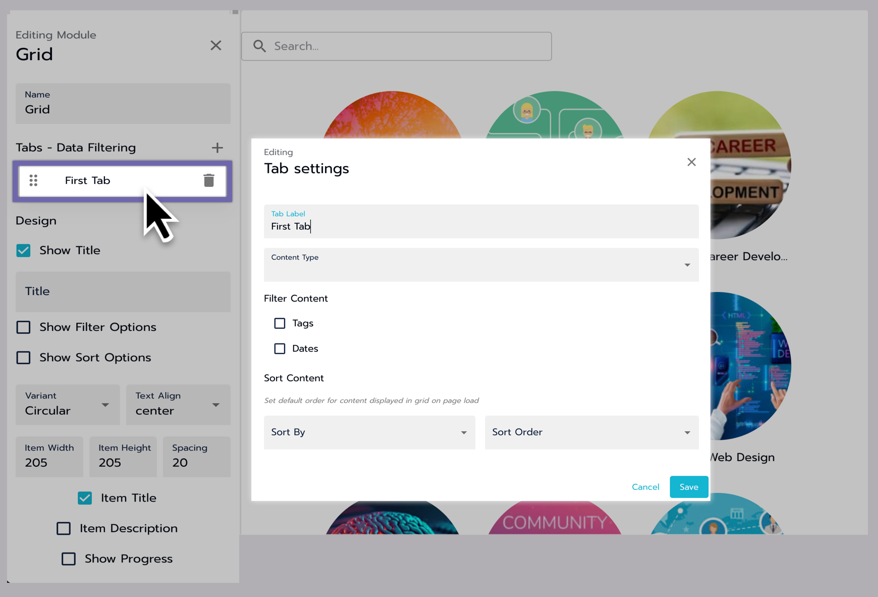
Configuring tab settings
Updating the Tabs settings.
Once you've created a tab, select it to adjust its settings.
Tab Label: This is the name visible to users if multiple tabs are created.
Content-Type: You can choose between Course, Group, and Session. Your selection impacts the filtering and sorting options available.
The Tab Settings window determines how the page/tab is pre-filtered and sorted, controlling how information appears when a user lands on the tab. Users can filter or sort the information further, but it will revert to the settings configured here upon leaving and returning.
Courses tab filter and sort options
Open the sections below for details on filter and sort options.
Course filter content options
Filter Content
Options
Options
Examples
Tags
Default Off
When selected, additional options appear for:
Required Tag(s): The content pulled Must have ALL of these tags
Optional Tag(s): The content pulled Can have ANY of these tags
Exclude Tag(s): Content with these tags will NOT be included
User Actions
Default Off
When selected, an additional drop-down appears for:
Optional User Actions:
Complete: Courses the user has Completed.
Enroll: Courses the user is enrolled in.
Start: Courses the user has started.
Waitlist add: courses the User is Waitlisted for.
Dates
Default Off
When selected, a + icon becomes available so you can add multiple date types and time ranges to function on the tab simultaneously.
Date Type: Choose the date type you want from the list of options—an explanation of each in the next cell.
Time Range: Choose the time range you want from the list of options—an explanation of each in the next cell.
Date Types:
These options are pulled from the date sections within course settings. If I choose any date type, I will filter the tab by that specific date on the courses.
Close enrollment:
End Date:
Open Enrollment:
Release Date:
Start Date:
Time Ranges:
Specific: This option gives you a drop-down labeled Range and a Date field.
Previous: Choosing this option gives you an additional field labeled Days
Relative: This option gives you a drop-down labeled Value with time frame options.
Upcoming: Choosing this option gives you an additional drop-down labeled Days.
When setting dates in the Grid Tab:
Date Type Selection: Choosing a Date Type filters courses based on that specific date.
Relative Timeframe: If selecting Relative and a timeframe, only courses matching the selected Date Type will appear if their date falls within the specified timeframe. For example, choosing Start Date and Next Week shows courses starting anytime the following week.
Before Date: When selecting Before and adding a Date, only courses with a date before the specified one will appear. For instance, picking End Date and May 27, 2023, displays courses ending before that date.
After Date: If you choose After and add a date, only courses with a date after the specified one will appear. For example, selecting End Date and May 27, 2023, displays courses ending after that date.
Date Range: Choosing Between and setting a date range only shows courses with dates falling within that range. For instance, selecting End Date and From May 27, 2023, To June 27, 2023 displays courses ending between those dates.
Combining Restrictions: Each set of date restrictions acts as an AND statement, narrowing down the results. For example, filtering for courses starting After May 31 and After June 31 only shows courses meeting both criteria.
Course sort content options
Sort Content
Options
Example
Sort By:
Alphabetical: grids are sorted by course title alphabetically, with numbers appearing before letters
Newest: The grids are sorted by course release date, with the latest releases appearing first
Start Date: The girds are sorted by the nearest start date, with courses starting in the past appearing last and the most recent start date appearing first
Sort Order:
Default: Ascending
Ascending: Changes depending on sort by options. See next cell.
Descending: Changes depending on sort by options. See next cell.
Alphabetical:
All Courses, regardless of their dates, should be returned in an alphabetically organized fashion (NOTE: courses that start with a number should appear before courses that don’t in the Ascending fashion and vice version in the Descending fashion)
Ascending: A - Z
Descending: Z - A
Newest:
All Courses whose Release Date both IS NOT null and is before today AND whose End Date is after today
Ascending: oldest to newest
Descending: newest to oldest
Start Date:
All Courses whose Start Date field IS NOT null
Ascending: oldest to newest
Descending: newest to oldest
Groups tab filter and sort options
Open the sections below for details on filter and sort options.
Group filter content options
Filter Content
Options
Options
Examples
Tags
Default Off
When selected, additional options appear for:
Required Tag(s): The content pulled Must have ALL of these tags
Optional Tag(s): The content pulled Can have ANY of these tags
Exclude Tag(s): Content with these tags will NOT be included
Dates
Default Off
When selected, a + icon becomes available so you can add multiple date types and time ranges to function on the tab simultaneously.
Date Type: Choose the date type you want from the list of options. —An explanation of each is in the next cell.
Time Range: Choose the time range you want from the list of options—an explanation of each in the next cell.
Date Types:
These options are pulled from the date sections within Group settings. If I choose any date type, I will filter the tab by that specific date from the Group.
Release Date:
End Date:
Time Ranges:
Specific: This option gives you a drop-down labeled Range and a Date field.
Previous: This option gives you an additional field labeled Days
Relative: This option gives you an additional drop-down labeled Value with time frame options.
When setting dates in the Grid Tab:
Date Type Selection: Choosing a Date Type filters Groups based on that specific date.
Relative Timeframe: If selecting Relative and a timeframe, only Groups matching the selected Date Type will appear if their date falls within the specified timeframe. For example, choosing Release Date and Next Week shows Groups starting anytime the following week.
Before Date: When selecting Before and adding a Date, only Groups with a date before the specified one will appear. For instance, picking End Date and May 27, 2023, displays Groups ending before that date.
After Date: If you choose After and add a date, only Groups with a date after the specified one will appear. For example, selecting End Date and May 27, 2023, displays Groups ending after that date.
Date Range: Choosing Between and setting a date range only shows Groups with dates falling within that range. For instance, selecting End Date and From May 27, 2023, To June 27, 2023 displays Groups ending between those dates.
Combining Restrictions: Each set of date restrictions acts as an AND statement, narrowing down the results. For example, filtering for Groups starting After May 31 and After June 31 only shows Groups meeting both criteria.
Groups I am a member of
Default: Off
No additional options
Displays only groups the user is a member of.
Privacy Level
Default: Off
Public: The group is public.
Private: the group is Private.
Public: Displays only groups listed as Public in the privacy setting within the group.
Private: Displays only Groups listed as Private in the privacy settings within the Group.
Group sort content options
Sort Content
Options
Example
Sort By:
Alphabetical: grids are sorted by Group title alphabetically, with numbers appearing before letters
Newest: The grids are sorted by Group release date, with the latest releases appearing first
Sort Order:
Default: Ascending
Ascending: Changes depending on sort by options. See next cell.
Descending: Changes depending on sort by options. See next cell.
Alphabetical:
All Groups, regardless of their dates, should be returned in an alphabetically organized fashion (NOTE: Groups that start with a number should appear before Groups that don’t in the Ascending fashion and vice version in the Descending fashion)
Ascending: A - Z
Descending: Z - A
Newest:
All Groups whose Release Date both IS NOT null and is before today AND whose End Date is after today
Ascending: oldest to newest
Descending: newest to oldest
Library tab sort options
Library sort content option
Sort Content
Options
Example
Sort By:
Alphabetical: grids are sorted by library title alphabetically, with numbers appearing before letters
Sort Order:
Default: Ascending
Ascending: Changes depending on sort by options. See next cell.
Descending: Changes depending on sort by options. See next cell.
Alphabetical:
All library items, regardless of their dates, should be returned in an alphabetically organized fashion (NOTE: Library items that start with a number should appear before items that don’t in the Ascending fashion and vice version in the Descending fashion)
Ascending: A - Z
Descending: Z - A
Session tab filter and sort options
Open the sections below for details on filter and sort options.
Session filter content options
Filter Content
Options
Options
Examples
Tags
Default Off
When selected, additional options appear for:
Required Tag(s): The content pulled Must have ALL of these tags
Optional Tag(s): The content pulled Can have ANY of these tags
Exclude Tag(s): Content with these tags will NOT be included
Dates
Default Off
Not configured for Sessions yet.
Check back later for updates.
When selected, a + icon becomes available so you can add multiple date types and time ranges to function on the tab simultaneously.
Session sort content options
Sort Content
Options
Example
Sort By:
Alphabetical: grids are sorted by Session title alphabetically, with numbers appearing before letters
Newest: The grids are sorted by Session release date, with the latest releases appearing first
Sort Order:
Default: Ascending
Ascending: Changes depending on sort by options. See next cell.
Descending: Changes depending on sort by options. See next cell.
Alphabetical:
All Sessions, regardless of their dates, should be returned in an alphabetically organized fashion (NOTE: Sessions that start with a number should appear before Sessions that don’t in the Ascending fashion and vice version in the Descending fashion)
Ascending: A - Z
Descending: Z - A
Newest:
All Sessions whose Release Date both IS NOT null and is before today AND whose End Date is after today
