
General settings
This guide is designed to assist clients and administrators in efficiently navigating to and setting up the specific features for their site's branding and theme presets.
Updating the Brand Assets and Theme in the Site Admin General Settings section.
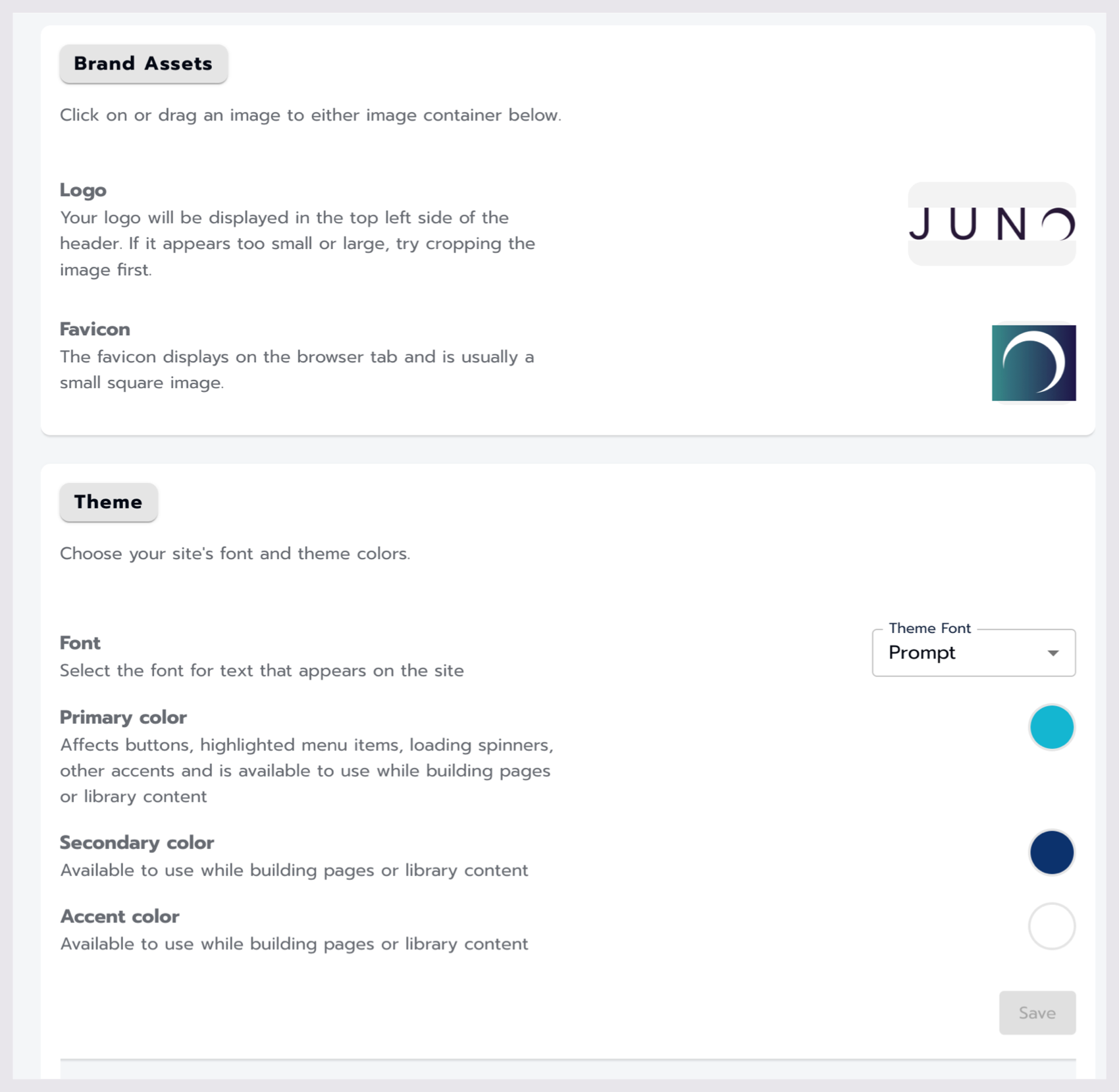
Brand Assets
Name | Result / Use Case | Options | Default YES | NO | Directions / Examples | Additional Information/ Requirements |
|---|---|---|---|---|---|
Logo |
Used in the top left corner of the header bar, users can quickly find their way back to the main landing page of your website. | Accepted file types: ‘png’, ‘jpg’, ‘jpeg’, ‘gif’, ‘webp’, ‘bmp’, ‘svg’ | NO | Click on or drag an image into the container to add your logo to your site. |
|
Favicon |
the little image on the browser tab | Accepted file types: ‘png’, ‘jpg’, ‘jpeg’, ‘gif’, ‘webp’, ‘bmp’, ‘svg’ | NO | Click on or drag an image into the container to add your favicon to your site.  Example Favicons
|
Sizing information The standard size for a favicon is 16 pixels wide by 16 pixels high, which is the size that appears in browser tabs, favorites lists, and address bars. However, some favicons may need to be larger. For example, 32 pixels by 32 pixels is the size for taskbar shortcut icons, 96 pixels by 96 pixels is the size for desktop shortcut icons, and 180 pixels by 180 pixels is the size for Apple touch icons. |
Theme
choose your site's font and theme colors.
Name | Result / Use Case | Options | Default YES | NO | Directions / Examples |
|---|---|---|---|---|
Font | The theme font updates the primary font family used through the site. |
| YES
| Select the Theme font dropdown and choose from the options listed to update your sites theme font. |
Primary Color
| Affects buttons, highlighted menu items, loading spinners, other accents and is available to use while building pages or library content 

| Any hex code or RGBA colors | NO | select the round color icon to either select a color from the Color Picker or enter a Hex or RGB color code. Optionally, you can enter a HEX or RGB color code in the Pimary text input box. |
Secondary Color | Available to use while building pages or library content | Any hex code or RGBA colors | NO | select the round color icon to either select a color from the Color Picker or enter a Hex or RGB color code. Optionally, you can enter a HEX or RGB color code in the Pimary text input box. |
Accent Color | Available to use while building pages or library content | Any hex code or RGBA colors | NO | select the round color icon to either select a color from the Color Picker or enter a Hex or RGB color code. Optionally, you can enter a HEX or RGB color code in the Pimary text input box. |
Related Articles
- Attaching access passes to content around the site.
- Creating and managing Access Passes
- Add and update users
- Using the utilities section of the site
- Library pages
- Managing Sessions
- Navigation
- Create and edit content on your site
- Grid modules
- Directory modules
- Rotator modules
- Getting started with the site admin
- Pages
- General settings
- Community