
Pages
The Pages feature in the Site Admin offers a powerful tool for real-time layout editing with an intuitive interface. This guide will walk you through creating pages, adding modules, and customizing them on your website.
Manage pages | Saving changes and deleting pages | Adding modules | Editing modules | Additional tips | Other modules
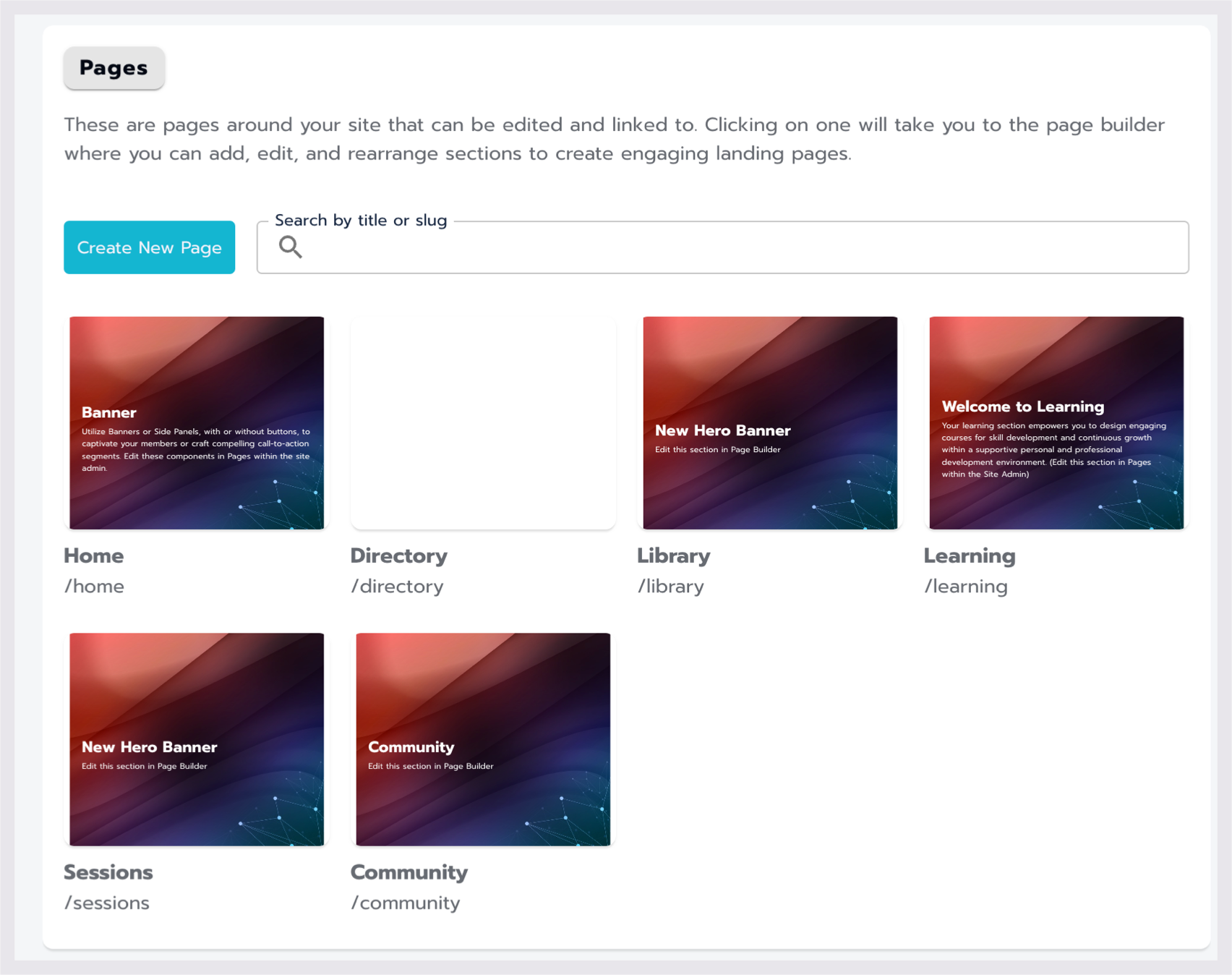
The Pages section of the Site Admin.
Manage pages
Creating new pages
Select the Create New Page button to start creating a new page.
Enter page details
In the Create a New Page window, enter a Name for your page. (this name is seen on the front end)
Optionally, edit the auto-generated slug for the page.
Select Create to proceed or Cancel to discard.
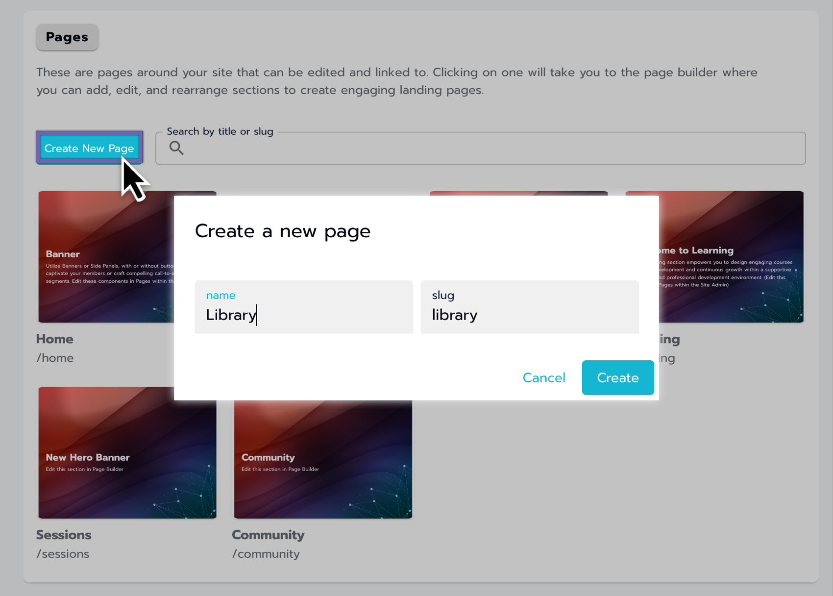
Creating a new Page within the Pages section of the Site Admin
Customizing pages
Once created, select the newly created page from the Grid to customize it.
The left-side navigation panel allows you to add and customize modules.
The right side displays a preview of the page.
Saving changes and deleting pages
Saving Changes
After making your edits, locate the Save Page button on the bottom right of the navigation panel.
Select the Save Page button to ensure all your changes are preserved.
Deleting Pages
To delete an entire page, find the Delete Page button on the bottom left of the navigation panel.
Select the Delete Page button, then confirm the deletion to remove the page.
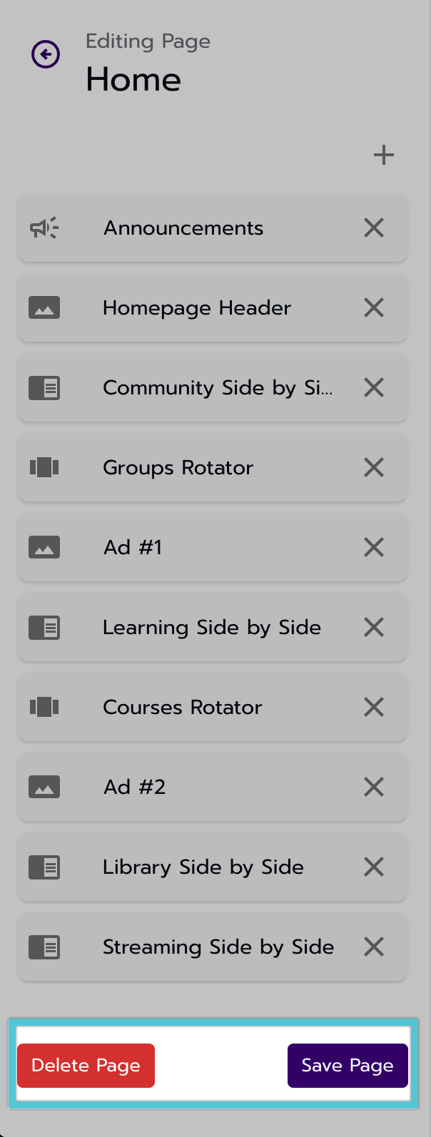
A view of the Save and Delete buttons on the page's navigation panel.
Adding modules
Select module type
Select the + icon in the left-side navigation to add a module.
Choose module
From the prompt, select the module type you want on the page (e.g., Hero, Side-By-Side).
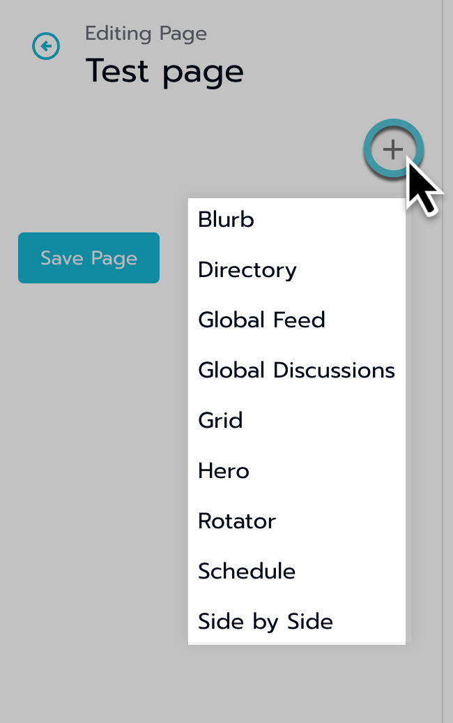
Adding modules to a new page.
Editing modules
After adding a module to a page, follow these steps to edit and arrange it.
Navigate into the module
Locate and select the module you want to edit. You will then be directed to the module, where you can make edits.
Editing modules
Use the provided options to modify the module's content and settings.
Arranging Modules
When multiple modules are present, you can reorder them by dragging and dropping the modules into different positions.
See specific module options below.
Announcements
Module Options
Name: You can change the module's name (not visible on the front end).
Title
Defaults to Announcements but can be updated to any title.
The title is visible to the public and appears at the top of the module.
This field is optional and has no character limit.
Check Box Options
Global Feed
Default: Off
If selected, announcements from the global feed will be featured in this module.
Tooltip: This will show all announcements from the global feed.
Global Discussions
Default: Off
If selected, announcements from global discussions will be featured in this component.
Tooltip: This will show all announcements from global discussions.
Blurb
Module options
Name: You can change the module's name (not visible on the front end).
Large Editor: Access a spacious editing area using the Large Editor button.
Blurb Editor: The Blurb editor provides a platform for adding, editing, and formatting text, emojis, and links using the TinyMCE editor.
Simultaneously, edit on the left and preview on the right.
Full Width Option: At the bottom of the module, you can select a box to utilize the entire width of the page. This formatting option ensures that the blurb content fits across the whole page width where the module is placed.
Global Feed
When a global feed module is added to a page, it serves as a centralized hub for sharing updates, announcements, and information relevant to the community.
Module options
Title: You can title the module (visible on the front end).
Global Discussions (Global Forum)
When the module for Duscissions is added to a page, it serves several functions to facilitate communication and collaboration among users.
Module options
Title: You can title the module (visible on the front end).
Hero (Banner)
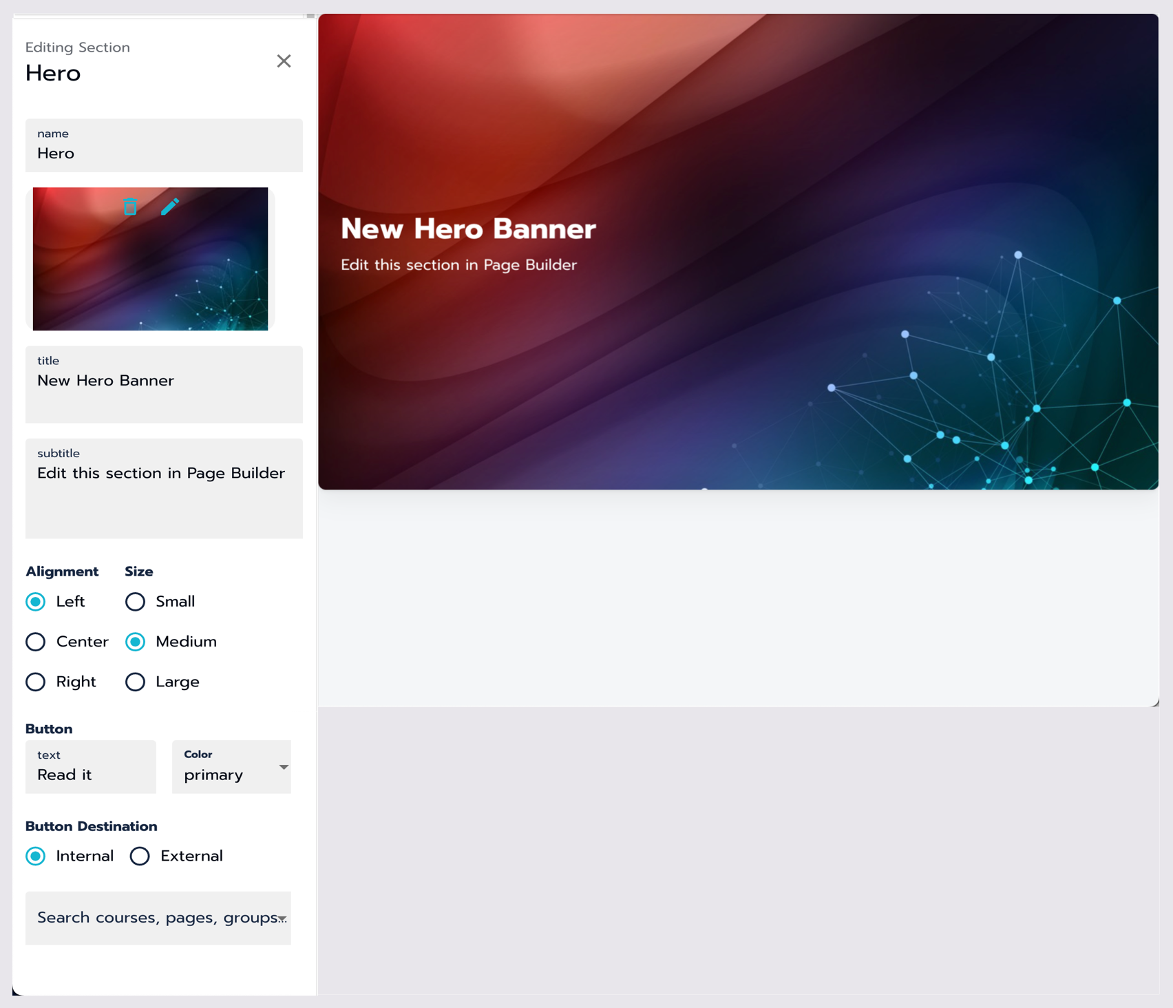
Setting up a Banner Module.
Pre-populated text
When editing a Banner module, it comes pre-populated with dummy text.
Banner size
Choose the size of your banner by selecting one of the radio button options:
Small
Medium
Large
Adding an image
Upload images for your module by using drag-and-drop or the file selector.
Supported file types include png, jpg, jpeg, gif, webp, bmp, svg.
You can edit the image multiple times by using the pencil icon or delete it and start over using the trash can icon.
Text options
Customize the alignment of the title, subtitle, and button using the radio buttons:
Left
Center
Right
Button design and destination
If you're adding a button to the banner, follow these steps:
Label the button in the Text field.
Choose a color for the button from the available dropdown options.
Specify the destination for the button:
For an Internal item (default), search for the name of a course, page, group, or session already created in the Search field.
For an External item, select External using the radio button and enter a valid URL in the URL field.
Schedule
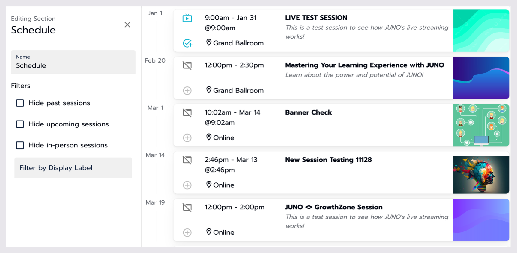
Setting up a Schedule module.
Module options
Name: You can change the module's name (not visible on the front end).
Filter Options: Use the checkboxes to customize your session display preferences:
Hide Past Sessions: Hides any session with an end date earlier than the current time.
Hide Upcoming Sessions: Hides any session starting later than today.
Hide In-Person Sessions: Hides all in-person sessions.
Filter By Display Label: This allows you to label sessions and filter for specific labels.
Side-By-Side
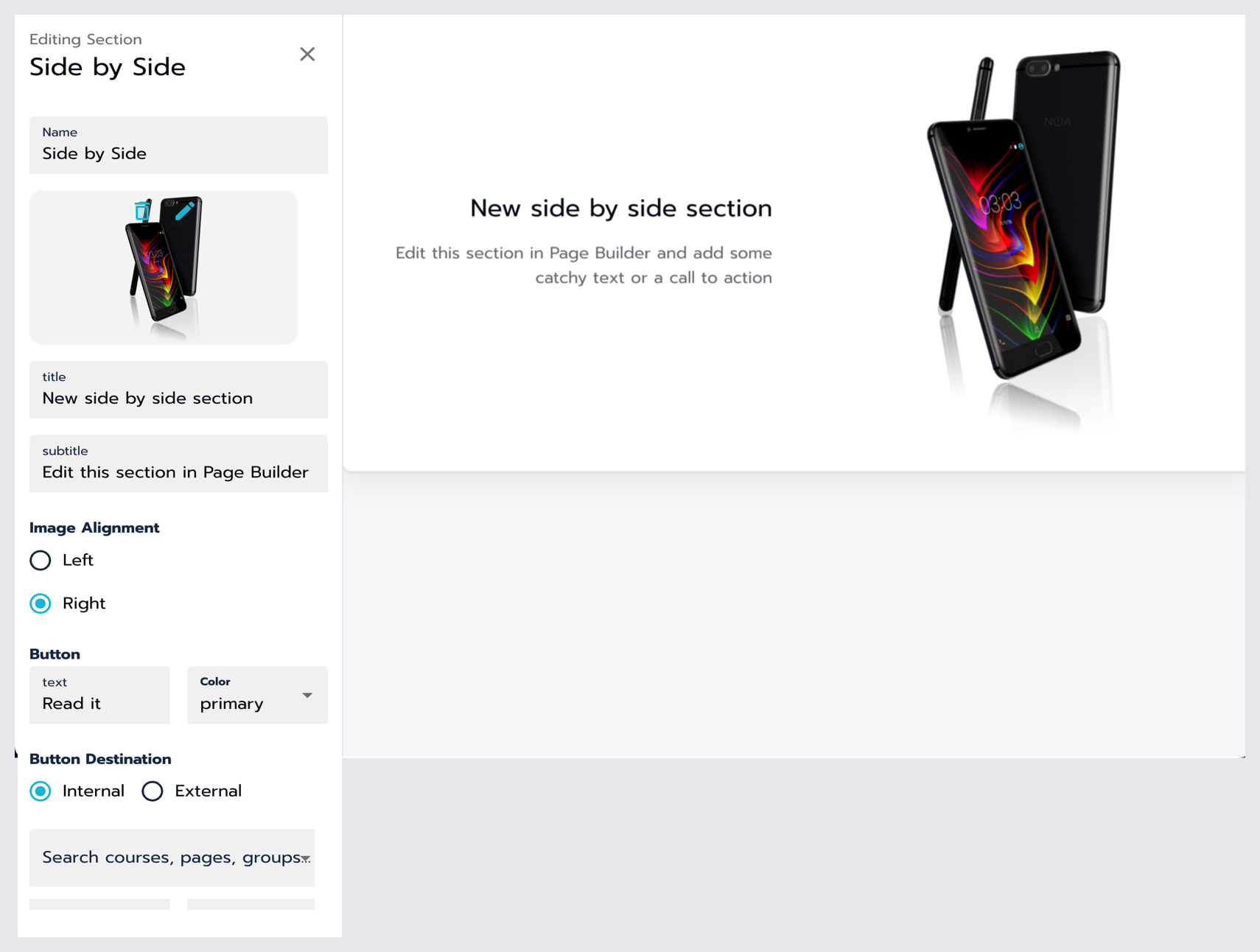
Setting up a Side-By-Side Module.
Pre-populated text
Similar to the Banner module, Side-By-Side modules come with dummy text.
Adding an image
Upload images for your module by using drag-and-drop or the file selector.
Supported file types include png, jpg, jpeg, gif, webp, bmp, svg.
You can edit the image multiple times by using the pencil icon or delete it and start over using the trash can icon.
Image alignment
Choose which side you want your image on using the radio button options for Left or Right
Button design and destination
If you're adding a button to the banner, follow these steps:
Label the button appropriately.
Choose a color for the button from the available options.
Specify the destination for the button:
For an Internal item (default), search for the name of a course, page, group, or session already created in the Search field.
For an External item, select External using the radio button and enter a valid URL in the URL field.
Additional tips
Experiment with different module types and configurations to achieve the layout you want.
Seek assistance from your JUNO team representative if you encounter any difficulties.
Other modules
Learn more about adding and customizing Grid modules.
Learn more about adding and customizing Rotator modules.
Learn more about adding and customizing Directory modules.
Related Articles
- Attaching access passes to content around the site.
- Creating and managing Access Passes
- Add and update users
- Using the utilities section of the site
- Library pages
- Managing Sessions
- Navigation
- Create and edit content on your site
- Grid modules
- Directory modules
- Rotator modules
- Getting started with the site admin
- Pages
- General settings
- Community